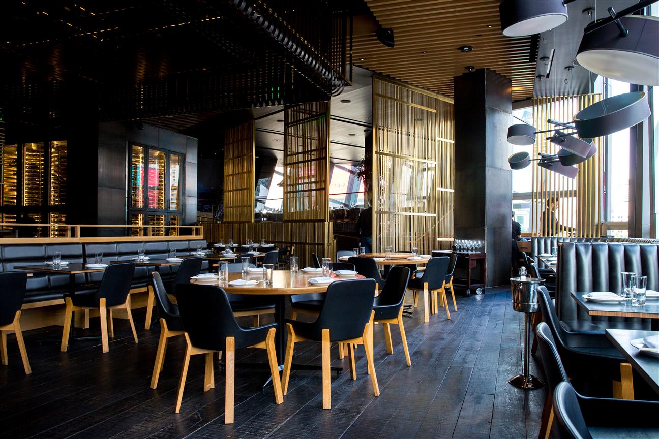
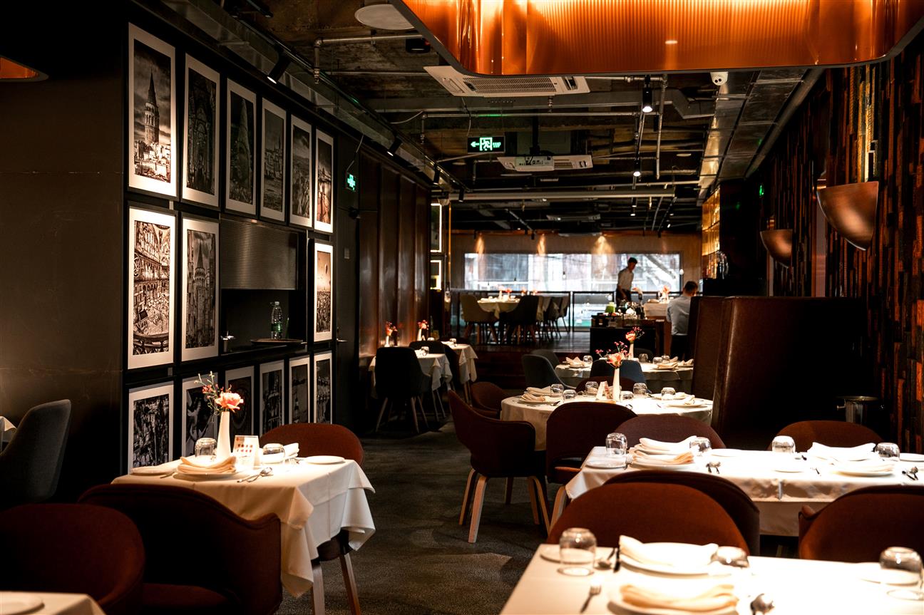
In restaurants, what attracts the attention of customers and makes them curious is not the service offered-the food. Yes, the services offered by the restaurant can be a source of interest, as they are described by customers who have been there before. But the reason why the first customers choose a restaurant is visual. There are a lot of different restaurant designs nowadays.
When you want to open a restaurant, you should have two goals:
To sustain and develop the business by providing sufficient material income
Creating a space for your customers to have a good time

FIRST OF ALL, YOUR ENTRANCE SHOULD BE INVITING
The entrance or the exterior of your restaurant, which is the first area that customers will see, should be inviting and interesting. Customers walking on the street or in the circulation aisles of the facility where your restaurant is located are looking for a visual difference, an attractive color-texture. In this quest, making an entrance design that shows yourself and is one step more attractive than your competitors will catch the customer's eye and put you in the first place in their choice.
THE AMBIENCE AT THE ENTRANCE SHOULD CONTINUE INSIDE
Let's imagine that you attract the attention of your customers to your restaurant. If you do all of the design on the exterior and offer a flatter space in the interior design, it is likely that your customers will go back and choose the side restaurant. In interior design, you should organize a good ambience, an interesting concept. In interior design, the size of the space, customer mass-characteristics, seating groups, in-space functions, etc. you should pay attention to the features. If you cannot create a design that can meet the potential customer capacity that will come to your restaurant, it is likely that you will lose your customers to the next restaurant again.
ATTENTION TO TECHNICAL ELEMENTS
No matter how much we have concentrated on design details in this article, you need to know some factors that play a big role in creating interior architectural design. If you want to get a successful design result, along with the design features of the restaurant, attention should be paid to the background business details. For example;
Location
Visibility from the customer bill
Pedestrian-vehicle circulation in the surrounding area
Who are your competitors? What features?
What is the budget allocated for the design?
Ventilation systems?
Lighting systems?
In-room acoustics?
.
.
Etc. it should not be forgotten that the questions affect the interior architectural design.

CREATE A TRENDING AREA
Before starting your restaurant design, you need to think about what will be the most likely trending concepts of our time and in the future. By examining the examples of restaurants that are successful today, we have collected concept examples for you that can strengthen the design with the right applications.
NOSTALGIC TEXTURES
If we take into account the attractive-aesthetic mood of the textures from the past on the customers, nostalgic concepts can give successful results in restaurants. Especially these areas, which middle-aged users are looking for with their longing for the past, attract great information. A streamlined design with accessories, colors, patterns from the 70s 80s 90s can create a warm space for outbuildings.
CLASSIC DECORATION
This concept, in which nostalgic textures are processed in a heavier atmosphere, creates a more stylish image with shiny surfaces with a golden-silver appearance. This concept, in which textile-fabric textures such as leather or velvet are used, aims to show the nostalgic mood to the customer in a more luxurious way.
A MODERN AIR
It attracts attention in modern style restaurants with the age of technology and the rise of simple textures. Within the framework of this concept, emphasis is placed on the function and the use of plain-flat textures is observed in the design. Sharp axle, most of the time, plain, glossy surface of the floor, wall and ceiling coverings, furniture, area size, depending on the light or dark(small open areas in liggt colors, large areas in dark colors are preferred) using colors, can provide a spacious, clean atmosphere to the users. When you look at modern concept restaurants, simplicity is the first design feature that stands out.
NATURAL ECO-FRIENDLY PLACES
The use of green texture is indispensable for this concept, which we can say that it is based on a modern concept. In these designs, you can understand that the service provided in the space is primarily a nature-friendly service. The materials and tools used are selected from special grades with the lowest waste capacity. Green textures are the first design feature to stand out in these areas, which give their customers a fresh breath.
MINIMUM
Minimal concepts can have similar characteristics as modern and eco-friendly concepts. They offer calm spaces to their customers with the slogan; "the less the better". In restaurants arranged according to the minimal concept, there are no distracting color-texture-accessory crowds. Instead, a limited number of plain colors without a pattern are kept (for example, 2-3 colors max.) instead of a crowd of accessories, flat coatings are chosen. It is aimed to provide a comfortable experience to customers by selecting textures that are easy to clean and have no patterns in moving-still furniture.
You can get help from Ankara Riva Interior Architecture with designs that appeal to every style for your dream restaurant. Together with our team, we bring unique perspectives to your living spaces with aesthetic and effective applications. Since 2006, we have been turning the projects you have in mind into reality for with happy customer portfolio, good design and correct applications.